Grouped "histograms" for categorical data in Pandas
November 13, 2015
One of my biggest pet peeves with Pandas is how hard it is to create a panel of bar charts grouped by another variable. I know that this would be nontrivial in Excel too, (I guess you’d have to manually create separate charts from a pivot table) but the problem is that I’ve always been taunted by the by parameter in histogram, which I never get to use since 98% of the time I’m dealing with categorical variables instead of numerical variables. And apparently categorical data have bar charts not histograms which [according to some sticklers are somehow not the same thing][1] (I insist they are!).
Since I refuse to learn matplotlib’s inner workings (I’ll only deal with it through the safety of a Pandas wrapper dammit!) up until now I’ve had to make do with either creating separate plots through a loop, or making giant unreadable grouped bar charts. But I just discovered a workaround using subplots in Dataframe.
Let me illustrate this with the Titanic dataset as an example. I wonder how much people paid for their tickets in First, Second and Third Class?
import matplotlib.pyplot as plt
import seaborn.apionly as sns

sns.set() #rescue matplotlib's styles from the early '90s

data = sns.load_dataset('titanic')
data.hist(by='class',column = 'fare')
plt.show()
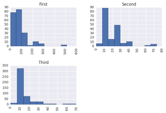
Wow look at all those $10-$20 fares in Second Class … those Third Classers who paid the same price got ripped off! I wonder what the embark_town distribution looks like for the different Classes? I’d love to just call
data.hist(by='class', column='embark_town')
But of course matplotlib freaks out because this isn’t a numeric column.
Well the good news is I just discovered a nifty way to do this. The trick is to use the subplots=True flag in DataFrame.plot together with a pivot using unstack. The subplots=True flag in plot is sort of the closest thing to the by parameter in hist, it creates a separate plot for each column in the dataframe. So we need to create a new dataframe whose columns contain the different groups.
First we create the using groupby and value_counts. Note that annoyingly you have to have to call sort_index on each of the groups, since by default they will come back either in a random order or sorted from highest making your plot unreadable (for this type of bar chart, or indeed any grouped bar chart, it’s really important that the groups are in a consistent order, to make it possible to compare groups at a glance, without having to use a legend.)
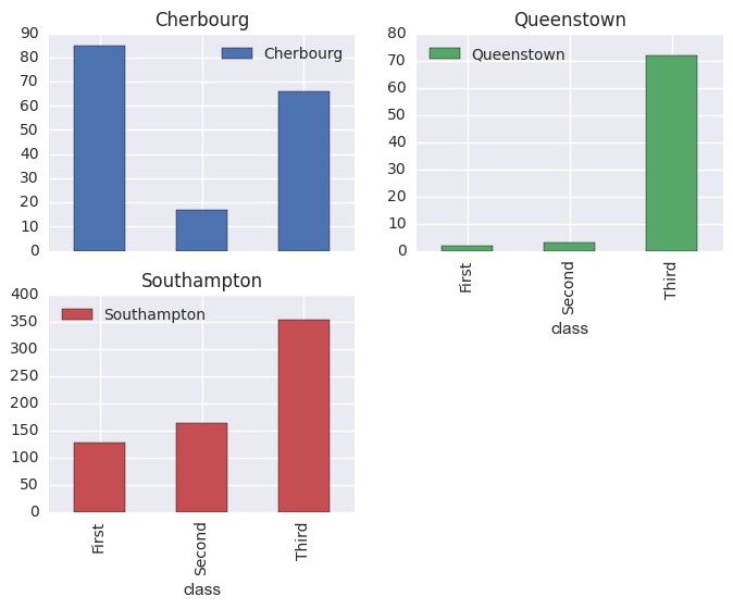
ag = data.groupby('class').embark_town.value_counts().sort_index()

class   embark_town
First   Cherbourg       85
        Queenstown       2
        Southampton    127
Second  Cherbourg       17
        Queenstown       3
        Southampton    164
Third   Cherbourg       66
        Queenstown      72
        Southampton    353
dtype: int64
Now if I call unstack on this series, the towns are pivoted to the columns and I get the dataframe
ag.unstack()

    embark_town  Cherbourg  Queenstown  Southampton
class
First               85           2          127
Second              17           3          164
Third               66          72          353
By default if I create a bar plot on this data, the chart will be grouped by town, which is probably sufficient for our purposes. But the magic for larger datasets, (where a grouped bar chart becomes unreadable) is to use plot with subplots=True (you have to manually set the layout, otherwise you get weird looking squished plots stacked on top of each other):
ag.unstack().plot(kind='bar', subplots=True, layout=(2,2))
Just to compare the syntaxes though, to create a panel of histograms we have:
data.hist(by='class', column = 'fare')
And to create a panel of bar charts (essentially the same thing) we have to use:
data.groupby('class')\
    .embark_town.value_counts()\
    .sort_index()\
    .unstack()\
    .plot.bar(subplots=True,layout=(2,2),legend=None)
I wonder if I could get the Pandas community to accept this as a default behaviour for hist when called on a non-numeric column ?!
def categorical_hist(self,column,by,layout=None,legend=None,**params):
  from math import sqrt, ceil
  if layout==None:
    s = ceil(sqrt(self[column].unique().size))
    layout = (s,s)

  return self.groupby(by)[column]\
             .value_counts()\
             .sort_index()\
             .unstack()\
             .plot.bar(subplots=True,layout=layout,legend=None,**params)

pd.DataFrame.categorical_hist = categorical_hist [1]:http://www.amazon.com/o/ASIN/0387245448/1.-20/